• Home
    • John Le Carre
    • Text Radio
    • Sideways Dictionary
    • Teach First
    • Showtown
    • Paper Wraps Stone
    • Cambridge University
    • Realtime Notes
    • Perpetual Disappointments Diary
    • Historic Houses
    • Generation Press
    • Action for Children
    • Cystic Fibrosis
    • Unicef
    • Creative Review
    • Paul Dalling
    • Mozilla
    • Zhuck
    • Healthy mealtimes
    • Paul Thompson
    • Little Chef
    • Smith & Milton
    • A Smile in the Mind
    • Poetry
    • Mr Blog
    • Pentone
  • Art by Sue Asbury
    • Biogs
    • Press
    • Contact
  • News
  • Shop
Menu

Asbury & Asbury

  • Home
  • Writing by Nick Asbury
    • John Le Carre
    • Text Radio
    • Sideways Dictionary
    • Teach First
    • Showtown
    • Paper Wraps Stone
    • Cambridge University
    • Realtime Notes
    • Perpetual Disappointments Diary
    • Historic Houses
    • Generation Press
    • Action for Children
    • Cystic Fibrosis
    • Unicef
    • Creative Review
    • Paul Dalling
    • Mozilla
    • Zhuck
    • Healthy mealtimes
    • Paul Thompson
    • Little Chef
    • Smith & Milton
    • A Smile in the Mind
    • Poetry
    • Mr Blog
    • Pentone
  • Art by Sue Asbury
  • About
    • Biogs
    • Press
    • Contact
  • News
  • Shop

Paper Wraps Stone

August 4, 2017

I’ve recently worked on an enjoyable project for Arjowiggins Creative Papers, collaborating with designers Build and printers Generation Press.

Paper Wraps Stone is a limited edition gift that showcases 20 Arjowiggins creative papers throughout a 226-page notebook.

Michael Place at Build asked me to write something on the theme of paper as a physical medium for creative thinking and ideas. The piece appears in full at the end of the notebook, but was deliberately written to be used as fragments throughout the notebook, so it becomes like a cut-up poem in itself.

I particularly like the way Build treat the words, arranging them in ways that add to the meaning, and turning it into an (appropriately) concrete poem.

As on previous projects, Build worked with printers Generation Press, and the result is as crisp and satisfying as things produced by Generation Press usually are. 

The book is being distributed by Arjowiggins and you'll have to ask nicely for a copy if you want to read/view/touch/sniff the whole thing – more pics and details here.

Design: Build
Print: Generation Press

With thanks to Christophe Balaresque and Florence Douek at Arjowiggins Creative Papers.

Tags Work, Poems

Technology explained, sideways

March 14, 2017

Today is the launch of Sideways Dictionary, a project I’ve been working on with Jigsaw, the technology incubator at Alphabet.

Sideways Dictionary is a collaborative online tool that explains technological issues using everyday analogies. I worked with Jigsaw to develop the concept and name for the dictionary and populate it with entries for the launch – covering about 300 analogies for 75 terms ranging from ‘API’ to ‘zero-day’. Some adapt analogies already in popular use, while most have been developed for this project.

Part of the mission at Jigsaw is to increase public understanding of the technologies that shape our lives. When I got involved, there was the seed of a thought about using analogies to explain technology in an accessible way. One of the examples was email being like sending a postcard, whereas sending an encrypted message is like sending a sealed envelope. People instinctively use analogies like that when explaining new concepts, but there was no central bank where they could be stored, searched and shared.

So that’s what the site aims to do. It’s now open to public contributions, with a voting facility to rate the best analogies – resulting in a shared resource for everyone to use.

The project has been developed in partnership with the Washington Post – the best analogies will be used on their site whenever a technical term comes up. And there’s a Chrome extension you can use to have Sideways Dictionary explain things across the web.

At this point, you should probably go off and play with the site. But for those interested, I’m now going to get geeky about analogies.

Analogies are fascinating things. When they’re good, they feel like magic – like discovering an underlying connectedness in all things. But they can also be frustrating – as a reader, you experience something close to physical pain when an analogy goes wrong, like it’s hurting the synapses in your brain.

The thing we kept coming back to throughout the project was that all analogies are inherently imperfect. The more perfect an analogy is, the less useful it is. The best analogies shed light on one aspect of an issue, but can never capture its totality. One of the advantages of Sideways Dictionary is that it gives you multiple analogies per term – each one may be imperfect, but together they have a cumulative effect. Even the process of working out where an analogy falls down leads you closer to an understanding of the issue.

The Art of Looking Sideways – image via It's Nice That

Throughout the project, and particularly when it came to the title, I kept thinking of Alan Fletcher’s The Art of Looking Sideways – the classic book about design and lateral thinking. This is more like the Art of Writing Sideways.

It’s a head-hurting form of writing. Analogies usually happen by serendipity – they occur naturally in conversations or in the course of thinking deeply about a subject. So to sit down and generate analogies mechanically is a weird process. But I found it’s like a concentrated version of what happens in creative thinking generally.

You take an issue like ‘secure socket layer’ or ‘wiki’ and that becomes your anchor point, like the end of the compass that stays in the centre of the page. Then you move the other end of the compass in a slow circle, passing through lots of areas – household objects, films, fairy tales, sports, games, cities, the natural world, pop culture, human interactions. All the while your mental compass is scanning through these worlds and trying to find matches back to the term at the centre.

When a match occurs, you try to capture the analogy in a single sentence and then expand as needed. Some colour and humour adds to its memorability and jaggedness. A good analogy can serve a twofold role – it’s partly about explaining the issue, and also about making it linger in the mind.

Fairytales are a rich source of analogies:

Others are rooted in shared human experiences:

The natural world provides some poetic analogies:

While the human world is harder-edged:

Some analogies involve real-world research:

Others find parallels in earlier forms of digital:

Some analogies enter surreal territory:

Others are more to the point:

The seed of the analogy is often in the name itself:

Analogies can reveal ancient parallels, between sheep farmers and programmers:

Some analogies are already in popular use:

Others took some imagination:

Like chess, analogies can feel like a beautiful game, or mental torture:

You can explore more analogies, and contribute your own, at sidewaysdictionary.com


Site design: Hello Monday
Films & animations: Google Creative Lab, London
Thanks to Alfred Malmros and Justin Kosslyn at Jigsaw for their patient support throughout the project.

In Writing Tags Work, Sideways

Verbal. Visual. Visceral.

August 19, 2016

Design company Johnson Banks is in the process of rebranding Mozilla and – in the spirit of openness that defines Mozilla – the whole process is being documented here: blog.mozilla.org/opendesign

I’ve been working with Johnson Banks on some of the verbal territories – not outward-facing copy, but strategic narratives that offer different takes on why Mozilla exists. It’s fascinating being involved at this stage – it feels like plugging into the motherboard of a brand and tinkering with it. A small insight could have a big outcome further down the line.

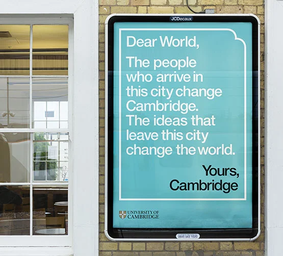
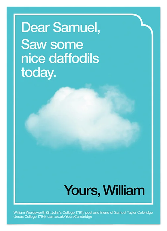
It’s also interesting to share this stuff openly – it counters the idea that branding is all about knocking out a few logos. Before you get to thinking visually, there’s the whole process of working out what you want to communicate. Johnson Banks pay especially close attention to this verbal stage, and you can see the results in the seven narratives (now narrowed to five).

Rather than me writing about it in detail, I’d suggest (if you’re interested) reading these posts in order:

Designing in the open 

Seven narratives 

Going deeper into the identity problem 

And then there were five

First design routes

But I’ll make one extra observation – I’m glad I’m a writer. Looking at the feedback, it’s clear that working in a world of words is a safer place than working with colours and shapes.

When the first-stage narratives were shared on the Mozilla blog, the response was thoughtful, positive and manageably small-scale. When the second stage came out, there was little response at all (although to be fair, this was more about refinement and people had already responded in stage one).

But the moment something visual appears (first design explorations), everyone has an opinion, and usually a strong one. Thanks to the way the process has been managed and communicated, there’s a higher ratio of constructive and thoughtful responses than you would normally get when a new logo launches. But the emotion level is also much higher – lots of withering put-downs and harsh critique.

I know people can respond viscerally to verbal stuff when it’s something short like a slogan or brand name. But with design, there’s no way round this onslaught on every project – people have a gut response, sometimes struggle to articulate it (because it can be hard to apply language to something purely visual), and the conversation spirals out of control.

In this case, the process is being managed by a smart client working with a smart design company, so it should stay on track. But whatever the eventual visual identity, I hope the project will make the larger point that branding a large organisation (when it’s done properly) is a process that involves lots of thinking, feedback, rejected work, refinement, and continual criticism – all the stuff that never gets written about when the press see the finished logo and dust off the usual ‘a consultancy got paid how much for this?’ article.

As well as that (and maybe counterintuitively), I hope it also highlights how you can’t entirely reduce branding to a process. For all the rigorous work, there is also that magic spark that can happen any time and from any direction – after which things fall into place instantly or incrementally.  

It’s worth following it all at blog.mozilla.org/opendesign – and let me know if you think of a good slogan that I can claim credit for.

Tags Branding, Work

Dear World... Yours, Cambridge

October 27, 2015

It was a great pleasure to be involved in this University of Cambridge campaign with johnson banks.

The campaign celebrates and amplifies the two-way relationship between Cambridge and the world, using a letter-writing framing device to host all manner of visual and verbal content.

The sheer richness of material inside an institution like Cambridge makes it an especially interesting one to write.     

You can read the full background in three parts on the johnson banks blog.

The campaign

The launch and film

The posters (a few examples below)

Tags Work

Beer books and mats

January 8, 2015

A quick post about two enjoyable projects I’ve been involved with recently – both with a beer theme, which may explain the enjoyment.

The first is The 100 Beer Project, in which design company SB Studio got the Liverpool Craft Brewing Company to bottle its own beer, then commissioned 100 designers to create bottle labels, each working with an ‘SB’ name, ranging from Stranded Badger to Silent Bingo.

I contributed this Foreword, which I decided might as well be 100 words:

There’s something about a beer label: a simple canvas attached to a uniquely appealing product. Every designer wants to do one.

And there’s something about restrictions. The modest size of the canvas and the deliberately limited starting point of names beginning with SB.

Then the game starts: on one level, a purely playful exercise in creative expression; on another level, a distillation of the purpose of design and branding – to give life and personality to the products around us.

This project gives 100 personalities to a single product: some witty, some weird, some bold, some beautiful. All subliminally branded: SB.

There’s some great work in the book, which you can buy here – all proceeds to ArtFund.

The second project is a festive collaboration with design company Build and printer Generation Press. I recently supplied words for the new Generation Press website and brand refresh, based largely around the word (Th)ink.

When it came to the Christmas mailer, we decided to make it all about (Dr)ink. So it’s a set of eight drinks coasters, each dedicated to a particular service area (Litho, Digital, Foiling and so on), but playfully relating it to a favourite tipple.

The nice thing about working with Build and Generation Press is you can count on it being beautifully designed and produced, which always makes the words look ten times better.

More pics here.

Tags Work
Older Posts →