• Home
    • John Le Carre
    • Text Radio
    • Sideways Dictionary
    • Teach First
    • Showtown
    • Paper Wraps Stone
    • Cambridge University
    • Realtime Notes
    • Perpetual Disappointments Diary
    • Historic Houses
    • Generation Press
    • Action for Children
    • Cystic Fibrosis
    • Unicef
    • Creative Review
    • Paul Dalling
    • Mozilla
    • Zhuck
    • Healthy mealtimes
    • Paul Thompson
    • Little Chef
    • Smith & Milton
    • A Smile in the Mind
    • Poetry
    • Mr Blog
    • Pentone
  • Art by Sue Asbury
    • Biogs
    • Press
    • Contact
  • News
  • Shop
Menu

Asbury & Asbury

  • Home
  • Writing by Nick Asbury
    • John Le Carre
    • Text Radio
    • Sideways Dictionary
    • Teach First
    • Showtown
    • Paper Wraps Stone
    • Cambridge University
    • Realtime Notes
    • Perpetual Disappointments Diary
    • Historic Houses
    • Generation Press
    • Action for Children
    • Cystic Fibrosis
    • Unicef
    • Creative Review
    • Paul Dalling
    • Mozilla
    • Zhuck
    • Healthy mealtimes
    • Paul Thompson
    • Little Chef
    • Smith & Milton
    • A Smile in the Mind
    • Poetry
    • Mr Blog
    • Pentone
  • Art by Sue Asbury
  • About
    • Biogs
    • Press
    • Contact
  • News
  • Shop

Chris Wilkins on jingles

January 6, 2015

The January issue of Creative Review takes music as its theme and I’ve contributed an article about advertising jingles: that enduringly effective commercial art form where music and copywriting meet.

In the course of researching the article, two of the first jingles that came to mind were ‘For mash get Smash’ and, inevitably, Go Compare. As the campaigns are nearly three decades apart, I was surprised to find the same copywriter associated with both. His name is Chris Wilkins and, when I got in touch to ask some questions, he sent some enlightening answers.

For the full article, you’ll have to subscribe to Creative Review. But they’ve allowed me to reproduce the Q&A here (an edited version appears in the magazine).

Chris Wilkins started out as a copywriter at JWT in the 1970s and went on to be joint creative director with John Webster at BMP. While there he won D&AD Silvers for his work on Cresta and Smash (although the jingle itself preceded his involvement) and was also involved in Pepsi’s ‘Lipsmackin’ campaign, created with Dave Trott. In 1985 he founded Davis Wilkins with Siân Davis and later sold the company to TBWA. Since 2005 the pair have worked as creative partnership Chris & Siân Wilkins, with notable successes including the jingle-led Sheilas’ Wheels campaign, and the operatic Gio Compario character for Go Compare.

Here are my questions and Chris’s answers:

Why do you think jingles work?

I think they can work in a couple of ways. They can act simply as an ID badge for the brand – a role which goes back to radio, I suspect, when music could add a distinctive ‘colour’ in a non-visual medium. ‘For mash get Smash’ is an example, as is the Pepsi ident, ‘Lipsmackinthirstquenchin’. These are really both traditional ‘stings’ – rather than jingles – serving primarily to glue the brand name to the preceding message.

Jingles act most powerfully as mnemonic devices. Just ask yourself – how much Victorian religious poetry can I recite from memory? Not so much. Now ask the question in a different way – How many Christmas carols can I sing along to? The music makes the words memorable, particularly through repetition.

What makes a good jingle?

There’s a phenomenon known in the neurology trade as an ‘earworm’ which refers to a piece of music that gets stuck in your head and no amount of conscious voluntary effort can banish it. Good jingles take up residence in your brain. They are ‘catchy’ with all that word’s association with contagion.

This is not just the case with advertising themes, of course. I recently found myself repeatedly humming an old TV series title track which I knew really well, but I couldn’t attach it to a programme. (It turned out to be The Rockford Files.) This is why it’s crucial for the brand property to be tightly knitted into the fabric of the jingle.

You cannot mentally sing along with Sheilas’ Wheels or Go Compare without mentioning the brand name. A lot of current advertising seems to start with a ‘borrowed’ song which is grafted arbitrarily onto whatever product message happens to be next on the creative to-do list. That’s just lazy.

Do jingles work better for a particular type of brief?

Jingles work most happily when there is a simple, single-minded message to be communicated. (Mind you, since that should be the case with all advertising briefs, you could argue that a jingle should always be considered as an option.) There is some research which suggests that people don’t take in rational sales messages that are sung to them, but there is also research suggesting that people don’t respond much to rational sales messages anyway. It’s an emotional business, and music has always been pretty good at stirring emotions.

You could argue  ‘For mash get Smash’ was already a great line without the need for music. How did that come about? 

When I moved to BMP in the early 1970s, to work with John Webster – sadly, no longer with us – the Smash campaign already had its musical pay-off. You’re right, it is a strong line anyway, so why set it to music? Well, times were different then and I think we were still very much under the spell of the Americans. The Madmen tended to sign off their films with a little musical ‘sting’ – almost as a parting gift to the viewer. Webster, in his own account, remembers briefing the composer, Cliff Adams, who happened to be sitting at his piano. Cliff said, “You mean something like this?” and played the four notes which, it is rumoured, were to earn him more in royalties than the rest of his TV work put together. When I wrote the first of the Martians scripts, the jingle was already a household property.

Sheila's wheels

Why did you choose a jingle/music-led route for Go Compare and Sheilas’ Wheels? Did the client come to you with that in mind, or was it your idea to go in that direction?

The client brief for what became Sheilas’ Wheels was simply to create a car insurance brand aimed at women. The name, the brand, the idea of a jingle was ours. Even the big pink ‘Sheilamobile’ was designed by Siân Wilkins, my art-director partner.

During our 35-year-long careers in advertising, neither Siân nor I had ever done a full-on jingle campaign. We wanted to devise a brand with ‘Girl Power’ (echoes of the Spice Girls) which led to our creating a ‘real’ singing group, styled on the 60s Motown sound.

We cast three brilliant session singers and – on the back of the advertising success – they actually toured the country as an act. The spin-off for the client was terrific. When one commercial asked women to post online videos of themselves dressed up and performing as our ‘Sheilas’, we had over 11,000 responses (some 240 from men) just for the prize of a guest spot in a commercial.

When I first saw the Go Compare TV ad I knew exactly where the tune had come from. Enrico Caruso was the first great recording star as his career peaked at the same time as gramophone records became popular.

The brief for Go Compare was to make the brand front-of-mind in a market of four pretty competitive comparison sites. The success of Compare the Market’s Meerkats had spooked everyone else. We were lucky, because our brand name was already a call to action, so we hit on the idea of using another call to action from WW1 – the song ‘Over There’ about US troops coming to the rescue in Europe.

We unearthed an old recording of the great Enrico Caruso singing the song, which inspired the notion of using an Italian operatic tenor and we had originally intended to cast an actor and have him mime to the track. We were lucky, as it turned out, to find Wynne Evans, then Principal Tenor at Welsh National Opera, who could not only sing, but was a great physical comic.

As well as being successful, the Go Compare campaign famously annoyed a lot of people. What’s your reaction to that?

Yes, it was voted Most Annoying Campaign in the marketing press for two years running. But, to put this in context, the year before the campaign broke Go Compare posted a loss of £4m. At the end of the campaign’s first year, they posted a profit of £12m. We went on to make fifteen increasingly ‘annoying’ films over the three years we worked with them.

Similarly, our campaign for Direct Line with that little red phone on wheels and its strident bugle-call jingle, was also voted Most Annoying. Direct Line grew to become the country’s leading car insurer. It’s funny how much you can achieve when you stop checking over your shoulder for the D&AD jury, and start working out how to make your clients rich.

Jingles are often seen as ‘unsophisticated’ and outdated – what’s your view on that?

There are fashions in advertising, as in every other form of ‘creativity’. Currently, there’s a powerful groundswell pulling advertisers towards social media and there’s this desperate optimistic belief among some clients that Facebook and Twitter are freebie media for business to exploit. Problem is, the wonderful professional skills out there – musical skills included – are being bypassed in favour of mass mediocrity. A million competent ukulele players on YouTube still don’t add up to one Mozart.

Would you say you have a musical ear? How important is it for copywriters to have a sense of rhythm and the ‘sound’ of words?

Siân and I are not particularly musical but we’ve been wonderfully well served by the musicians we’ve worked with – particular the guys at Yellow Boat Music whose ingenuity created a whole raft of musical styles for Go Compare, ranging from Baroque Chamber to Moroccan Folk.

We’ve also evolved a secret trick for writing lyrics which composers can work with. If you want to write a great jingle, write it to an existing tune. That way, it will have an inbuilt ‘lyrical’ structure to it. Then, when you hand the words over to a composer – and here’s the secret bit – don’t tell him what your tune was. That’s what we did with Sheilas’ Wheels and the legendary film music composer, John Altman, took it from there.

Particularly with Smash and Go Compare, you’ve produced work that has entered the nation’s collective memory. How does that make you feel?

Lucky.

Do you have any favourite jingles (either your own or someone else’s)?

Of my own stuff, I’m quite proud of rhymes like ‘With just a few clicks / Save your spondulicks’ and ‘It’s where you go ter / Insure your motor’ for Go Compare. And I was also pretty happy with ‘If you had a name like Florence / And you needed car insurance’ for Sheilas’ Wheels.

But there have been some great jingles over the years. Dave Trott knows how it’s done – his ‘Gertcha’ spot for Courage beer and his ‘Ariston... and on...’ were classics. But my all-time favourite has to be, ‘You’ll wonder where the yellow went / When you brush your teeth with Pepsodent’. That was written in 1948.

Thanks to Chris for his answers – you can read the entire article in the January edition of Creative Review.

Tags Advertising, Press, Creative Review

Rough notes on 2014

December 9, 2014

This isn’t exactly a comprehensive review of the year, more a trawl back through things I’ve tweeted or favourited over the past 12 months – Twitter can be a useful mental archive that way (when it’s not being used for retrieving lost property, as in my most shared tweet of the year). 

One of the common themes is mortality (please keep reading). This was the year we lost great advertising writers including David Abbott (The Economist, JR Hartley and countless others) and Julian Koenig (Volkswagen ‘Think small’), and stars of design including Wally Olins, Massimo Vignelli and more recently Rodney Fitch. I wrote about David Abbott here and reviewed Wally Olins' last book for Creative Review (subs only). Also recommend New York Times on Julian Koenig and Michael Johnson on Wally Olins.

One writer happily bucking the trend is Clive James, who recently admitted to being “in the slightly embarrassing position where I say I’m going to die and then don’t.” His ‘Japanese Maple’ won widespread praise this year and he continues to write lucidly and arguably better than ever as he approaches the end.

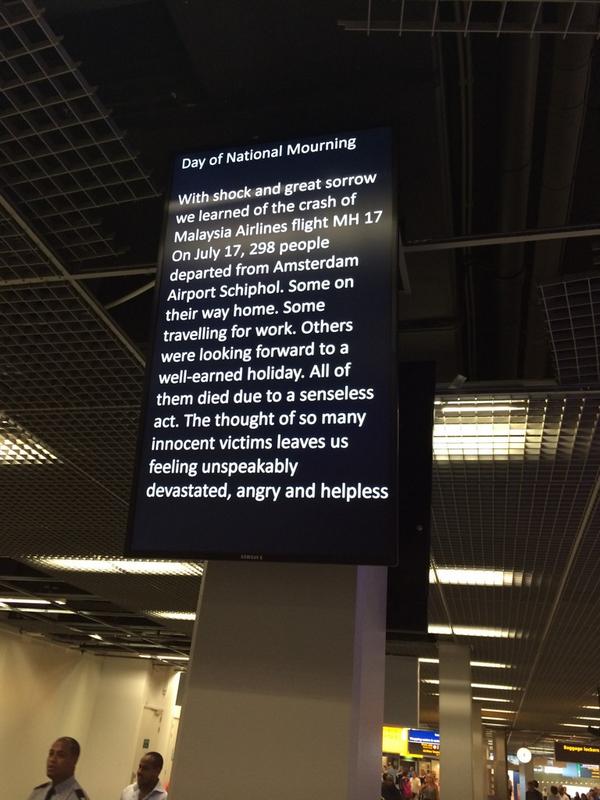
Death has a way of leading to great writing. In the bleak aftermath of the MH17 flight, these notices in Schiphol Airport (via @jessbrammar) were a civilised, secular piece of corporate writing.

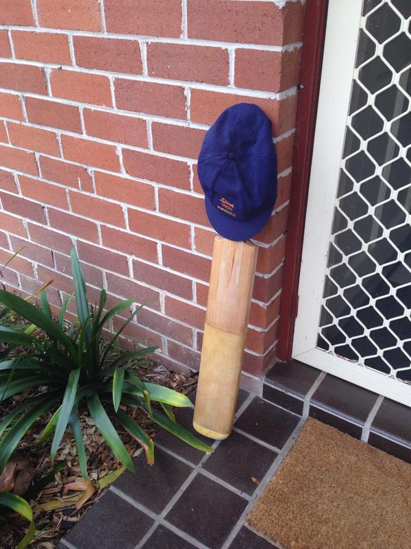
More recently, the sudden death of cricketer Phillip Hughes saw collective grief expressed through a powerful symbol. Hard not to be moved by #putoutyourbats 

Such genuine expressions of grief put into severe perspective the trend for ‘sadvertising’ that has been noted by a few commentators this year – referencing ads that aim to make us cry rather than laugh.

What will your beauty legacy be? In our Dove film Legacy, we look at how our beauty confidence can echo through the women in our lives... especially our children. Subscribe to our YouTube channel [http://goo.gl/Gm2XKY] Dove.com [https://www.dove.com] Facebook [https://www.facebook.com/DoveUS] Twitter [https://twitter.com/dove]

For example, there’s Dove challenging mothers and their daughters to confront their inherited ideas of body image (quite moving to watch, but always in the uncomfortable knowledge that you’re being sold a brand positioning).

Presenting the new Sainsbury's Christmas advert. Made in partnership with The Royal British Legion. Inspired by real events from 100 years ago. This year's Christmas ad from Sainsbury's - Christmas is for sharing.

Then there’s the camera rising from the trenches of the First World War and that big Sainsbury’s logo appearing in the sky (in the Christmas ad that at least moved the conversation on from John Lewis). Whatever you think of it, it’s hard for brands to associate themselves with issues so real and emotionally charged without at least a whiff of self-interest surrounding the whole thing. (At the other end of the life cycle, this was also the year that a detergent brand live-tweeted the birth of a new baby.) 

Then again, for all that we feel uncomfortable with brands intruding on the serious issues of life and death, sometimes life and death intrude on brands. This Costa coffin (in which a woman who was a great fan of the coffee chain requested to be buried) has a jarring and, let’s face it, blackly humorous effect. But there’s something moving about the way people form such an affection for brands – albeit not the kind of connection Costa can place at the centre of its next ad campaign.

Even more affectingly, there was this story of a son keeping his dead father’s memory alive by racing against his digital ‘ghost’ on Xbox (worth reading the whole thing here). Again, not something Xbox can easily turn into an advert (although it’s not out of the question).

Before leaving the subject of life and death, I was pleased this year to come up with a line for this bench plaque, dedicated to the very-much-alive Ben Terrett – backstory here. 

So, on to lighter things. Packaging copy continues to entertain and amuse, usually not intentionally.

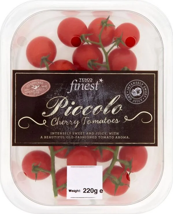
This was the year of tomatoes with the unmistakable aroma of, erm, tomatoes. (via @whatsamadder). 

Leading edge chocolates for chocolate eaters who mean business.

And the most middle-class copy ever for Waitrose (via @will_jkm)

There was also some good stuff, like this Cultivating Thought project for Chipotle, which uses packaging as a platform for interesting writing – would love to see more brands doing this, rather than chatting away about a product you’ve already bought.

Now the quickfire round:

Best speech

Bob Hoffmann hailing the Golden Age of Bullshit at Advertising Week Europe. Uncomfortable applause all round.

Best TV ad

Take a look inside BLAH Airlines Flight 101 from Newark to San Francisco. Witness the harsh reality of nearly six hours of flying at its worst, from takeoff to landing. Unfortunately, this is a familiar experience for far too many travelers. If you've been flying BLAH, it's time to take a radical departure to Virgin America.

Not strictly TV, but a 6-hour pre-roll on YouTube for Virgin America (created by Eleven in San Francisco), imagining a deathly boring competitor called BLAH Airlines. A well-worn strawman strategy, but brilliantly done: advertising as high commercial art. 

Best press ad

This Unlaunch ad for the VW Bus (actually 2013 I think).

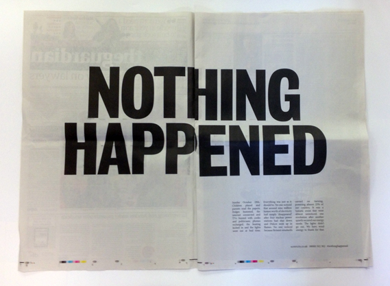
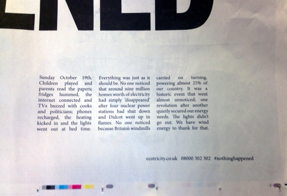
And this Nothing happened ad for Ecotricity.

Worst print ad

This Cobra campaign, which is apparently based on the fact that Cobra is an anagram of BraCo, so let’s imagine a company that makes bras and... and... sorry, I resign. (How that brainstorm should have ended.)

Best exhibition graphics

Enjoyed these simple, writing-led graphics that completely make sense of the Design of the Year exhibition (by Ok-RM). 

Most heroic filler copy of the year

This description of curtains is one of the most stoically professional pieces of writing ever crafted, taken from the IKEA website. 

Best non-commercial writing project

Pop Sonnets: reimagining pop songs as traditional sonnets. Lovely idea, skilfully written.

Best national slogan

Only one contender: this wonderfully evocative Ivory Coast team slogan for the World Cup. I wrote an analysis of all 32 slogans for Creative Review, including Brazil’s ‘Brace Yourselves, the 6th is coming’, which proved painfully prescient when they got hammered 7-0.

Weirdest strapline

Burger King’s new strapline was another milestone on the continuing journey into pure abstract thought that is currently being undertaken by all global brands. By 2019, all brands will have replaced their straplines with a steady, mantra-like hum. 

Brand extension of the year

This story about trademarks registered by Donald Trump is gold from start to finish (via @design_week)

Protest branding of the year

The $urreal: a mock banknote and social media campaign protesting against rising inflation in Brazil and the increasingly ‘surreal’ prices of everyday goods. 

Protest song of the year

Uploaded by Bruce Springsteen on 2014-04-10.

Bit obscure, but in a year of continued austerity while the rich get richer, I liked this 64-year-old singing a 17-year-old’s song.

Plagiarism of the year

Will award this to The Sun for nicking our Nation’s Prayer and filming themselves reading it in Brazil. Happily, they eventually made a donation to Street League.

Image of the year

Has to be the one at the top of this post, from Ferguson. Sadly, ‘Hands up, don’t shoot’ and ‘I can’t breathe’ are also the most memorable slogans of the year. 

There ends this incomplete and impressionistic review of 2014, which nevertheless took ages to write.

If only there was an efficient way of keeping track of an entire year in diary form. 

Tags Advertising, Slogans, Branding, Miscellaneous, Spotted, Review of the year

Get Christmas all wrapped up

November 24, 2014

(That headline is just to annoy the people behind this.)

A couple of weeks ago, we launched Perpetual Disappointments Diary: the appointments diary and journal with a series of disappointing twists. The London Metro has since described it as the ‘Best. Diary. Ever.’ which is our best review ever. Thanks to anyone who has ordered it or shared it in any way – greatly appreciated.

This post is to alert you to the fact that we’re now doing a gift-wrap service, so you can send the diary directly to your friends and avoid having to see them in person.

Visit the store here and choose from the gift-wrapped (£15) or non-gift-wrapped (£13) versions.

Here is the video we used to promote the diary – haven’t posted it here yet. 

Perpetual Disappointments Diary published by Asbury & Asbury and available from disappointmentsdiary.com Music: Everyday is like Sunday © Morrissey/EMI Records (1988)

And on a related note, I found myself writing a weird thing mixing the lyrics of Every day is like Sunday and Blue Monday. It's called Every day is like Blue Monday.

Tags Disappointments Diary

Perpetual Disappointments Diary

November 4, 2014

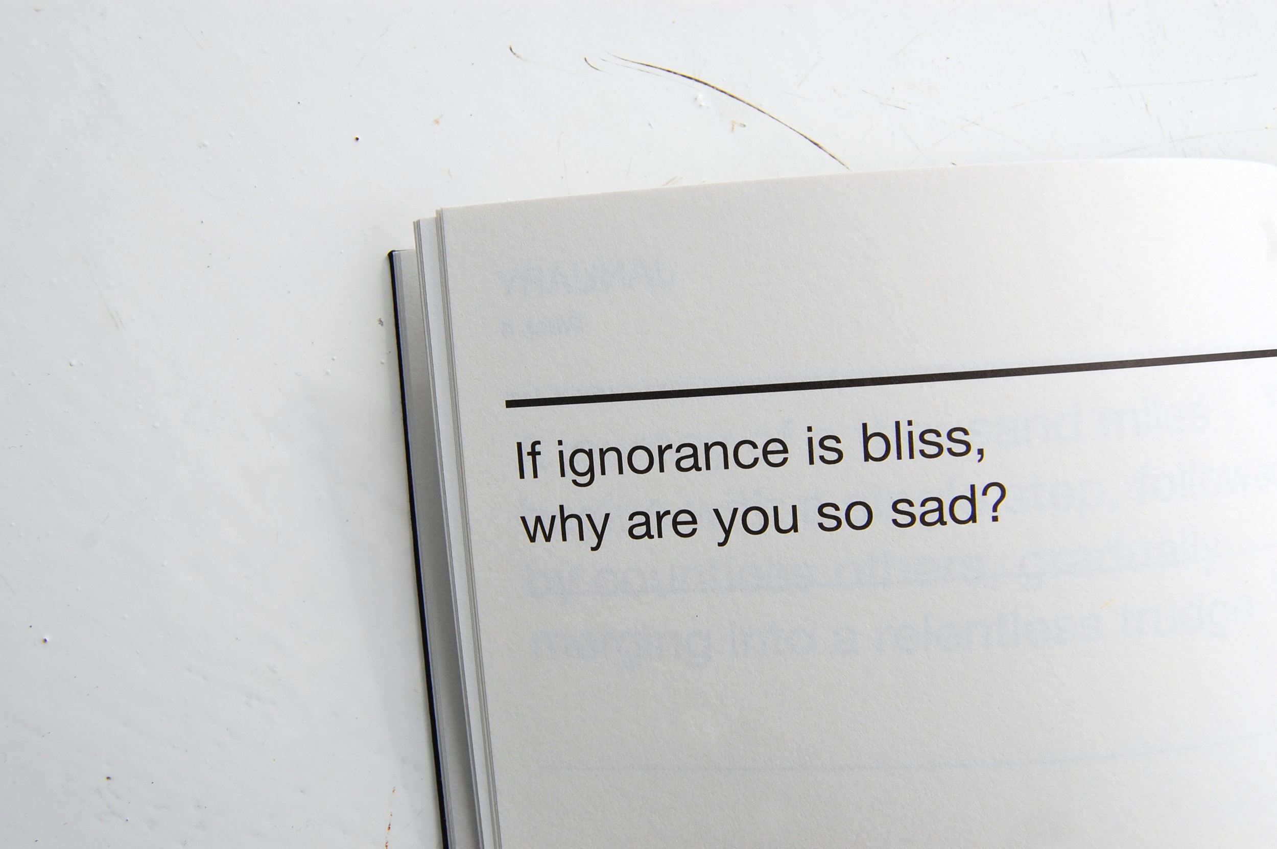
Today we release a new version of Disappointments Diary, which we first published in 2012. The new version (available here) comes in a larger, more cumbersome format, suitable for use as a journal and week-to-view appointments diary. It’s not specific to one year and can be used any time, hence the name Perpetual Disappointments Diary.*

As before, the diary contains a weekly demotivational proverb, combining new ones with the most depressing of the old ones.

Targeting the international loser, we have included a section of Useful Phrases translated into French, German, Spanish and Mandarin.

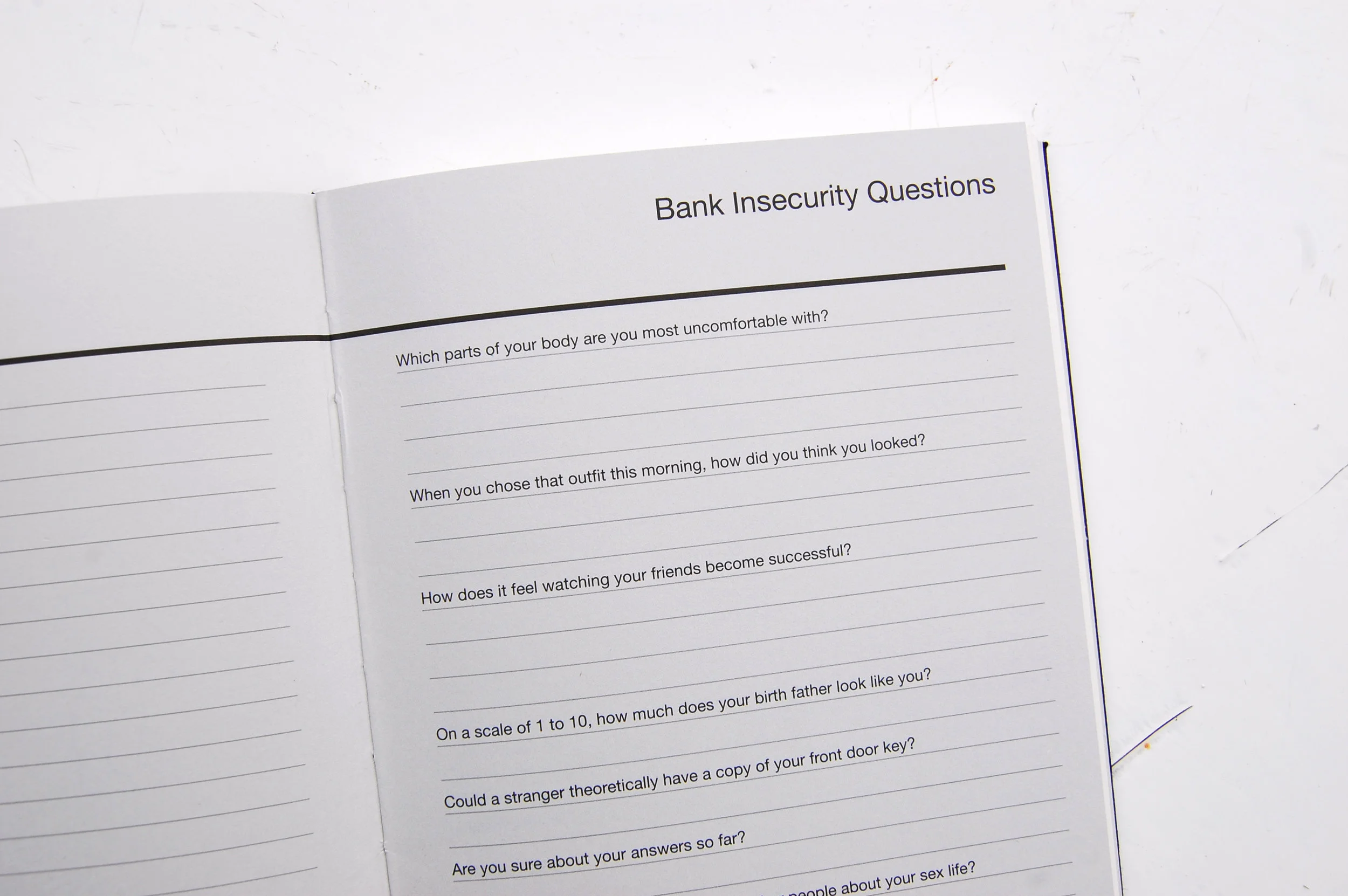
Other additions include Bank Insecurity Questions (first published on McSweeney’s Internet Tendency), Personal SWOT Analysis, double the amount of Notable Deaths, and templates for Apology Notes and Passive-Aggressive Notes.

The diary comes with months and dates marked as normal, and a sheet of Monday stickers to mark the start of each working week. Dimensions are 210mm x 130mm.

Creative Review have written about it here.

Our strategic rationale is that it’s hard to do a new diary every year and there’s only a short window in which to sell each one, so by doing a Perpetual version, we free ourselves from having to do it again, while allowing us to flog this one grimly for years to come. 

Perpetual Disappointments Diary is available from disappointmentsdiary.com for £13+p&p

This version is written and designed by Asbury & Asbury, based on an original design by Jim Sutherland, Hat-trick Design and Sue Asbury. You can read more about the original version in these previous posts. 

Please buy the diary now.

* The name was Sue’s idea, which is pretty good for a designer.

Tags Disappointments Diary

Read me writing about Read Me

October 13, 2014

I’ve written a review of Read Me: 10 Lessons for Writing Great Copyin this month’s Creative Review. You can read it here if you’re a subscriber or buy a print copy.

The book is by Roger Horberry and Gyles Lingwood and is a smart overview of writing for advertising and design (which, as the authors argue, could be better described as ‘brandwriting’). For anyone starting out, I think it’s the best practical primer out there. And for anyone more established, it’s worth buying for the many examples it includes – indeed, it would be nice to see an extended version consisting purely of examples and lots more of them. Even in the days of blogs and online archives, it’s useful to have a physical book that you can dip into for inspiration and reference. 

The book is available from, among other places, Best Little Bookshop(a UK-based alternative to Amazon). 

Tags Advertising, Branding, Press, Tone of voice, Creative Review
← Newer Posts Older Posts →